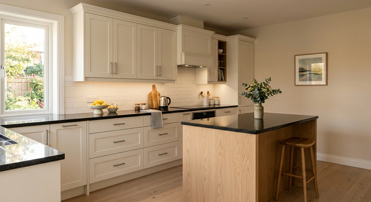
What color cabinets with black granite countertops work best depends on the stone’s undertone. Some slabs read as solid black, while others lean warm brown-black or cool blue-black. The counter anchors the room, and the cabinet color sets the overall mood.
White cabinets create familiar high contrast, but they are not the only practical choice. Warm whites, greige, muted green, white oak, walnut, navy, and charcoal can all work. The cabinet finish should coordinate with the granite, floor, backsplash, hardware, and available light.
Stock cabinet colors usually cost the same within a manufacturer’s standard line. Custom colors, glazing, distressing, and specialty sheens often add labor and expense. If the cabinet boxes remain sound, professional repainting generally costs less than replacement. Careful preparation determines how long the new finish lasts.
What Color Cabinets With Black Granite Countertops Work Best?
Warm off-white offers the safest and broadest appeal. Benjamin Moore White Dove and Sherwin-Williams Alabaster provide contrast without looking icy beside warm floors or cream-colored stone flecks. Comparable cabinet-grade factory finishes can produce the same effect.
Natural white oak is a strong wood choice when you want warmth without cherry’s red cast. Walnut creates a richer, lower-contrast result. Muted sage and olive complement granite with brown, gold, bronze, or moss-colored minerals.
Greige connects black countertops to beige tile, taupe walls, and mixed undertones. Navy works best in a bright room or on an island. Black and charcoal cabinets need generous lighting because dark counters and doors can visually merge.
| Cabinet color | Best use | Good companions | Main tradeoff |
|---|---|---|---|
| Warm white | Small or moderately lit kitchens | Oak floors, cream tile, brass or black hardware | Shows splatter and dark grime around pulls |
| Greige | Transitional kitchens with mixed undertones | Taupe backsplash, brushed nickel, medium oak | Can look dull under weak artificial light |
| Sage or olive | Granite with brown, gold, or green movement | Warm white walls, brass, terracotta, or oak | Gray-heavy sage can look muddy beside warm stone |
| Natural white oak | Modern, Craftsman, or Scandinavian-influenced rooms | Warm white tile, brushed nickel, matte black accents | Some clear finishes amber with age |
| Walnut | Large, well-lit kitchens and furniture-style islands | Ivory backsplash, warm metal, light flooring | Low contrast can make the room feel heavier |
| Navy | Bright kitchens or a contrasting island | White tile, pale oak flooring, brass, or nickel | Dark counters and doors may merge visually |
| Charcoal or black | Large contemporary rooms with layered lighting | Light backsplash, pale floor, restrained hardware | Shows dust, fingerprints, chips, and uneven reveals |
Read the Granite Before Choosing Paint
Clean the granite before evaluating its color. View it in daylight with the under-cabinet lights turned off. A slab that looks solid black from across the room may reveal silver crystals, brown clouds, burgundy flecks, or green tones up close.
Those secondary colors should guide the cabinet palette. Cabinets cover more vertical area than the countertop, so they can make subtle stone undertones look stronger. Place large samples beneath the counter edge rather than flat on top. Vertical and horizontal surfaces receive light differently.
Absolute Black and other uniform stones tolerate crisp contrast and simple cabinet colors. Granite with strong veining or dense speckling usually looks better beside quiet finishes. Distressed paint, glazing, or strongly figured wood may compete with an active stone pattern.
For warm brown or gold movement, test cream, warm greige, white oak, walnut, and olive. For silver or cool gray movement, consider clean white, pale gray, navy, or neutral rift-cut oak. Always approve samples beside the installed countertop. Photographs and small stone chips rarely show the slab’s full pattern.
White and Off-White Cabinets
White cabinets create the clearest contrast with black granite. They also keep a dark countertop from making the room feel top-heavy. Warm whites work especially well with oak floors, cream tile, and tan or gold mineral flecks.
Benjamin Moore White Dove has a soft, warm appearance. Sherwin-Williams Alabaster also avoids the blue cast found in many bright whites. Benjamin Moore Chantilly Lace looks cleaner and crisper, so it better suits cool veining and neutral flooring.
Compare the cabinet sample with both the countertop and backsplash. A white that looks neutral alone may turn yellow, pink, or gray beside other finishes. Check the sample during the day and again under the kitchen’s evening lights.
Warm white shaker doors add modest shadow lines without heavy ornament. White slab doors look more modern, but broad surfaces can reveal fingerprints and slight waviness. Avoid pairing creamy cabinets with a stark blue-white backsplash unless you want a visible temperature shift.
Greige, Taupe, and Light Gray Cabinets
Greige works well when the kitchen includes beige flooring or a backsplash with gray and brown tones. It softens the contrast between black and white. Greige also suits inset, framed, and traditional cabinetry.
Sherwin-Williams Accessible Beige provides a familiar warm greige reference. However, exposure and nearby materials can change its appearance. Benjamin Moore Revere Pewter offers another useful starting point, though dim light may bring out its gray-green cast.
Choose light gray more carefully. Many black granites look warmer at home than they do under showroom lighting. A blue-gray cabinet can clash with brown-black stone, especially beside honey oak floors.
If you want gray cabinets, match the paint to a visible mineral in the granite. Do not rely on the color name alone. A balanced greige usually ages better than cold medium gray applied to every surface.
Green Cabinets
Sage and olive introduce color without overpowering a black countertop. Granite with moss, bronze, brown, or muted gold inclusions responds particularly well to olive-based paint. Use a pale backsplash to keep the room from looking murky.
Sherwin-Williams Pewter Green is deep and subdued. It works better in a bright kitchen or on an island than in a narrow room with few windows. Lighter gray-green finishes can cover full cabinet runs when the room has warm, adequate lighting.
Pair green cabinets with white oak floors and warm white walls for a traditional palette. Aged or unlacquered brass adds warmth. Brushed nickel gives a quieter result when the granite contains silver flecks.
Green shaker doors suit Craftsman, English-inspired, and transitional kitchens. Slab doors make the same color feel more contemporary. Bright mint, teal, and heavily grayed greens tend to show their design era sooner when used throughout the room.
Natural Wood Cabinets
Natural white oak balances black granite with pale brown warmth. It offers more contrast than walnut but feels softer than painted white. Rift-sawn and quarter-sawn oak show straighter grain than plain-sawn boards.
Controlled grain works especially well on slab doors and modern shaker fronts. A clear waterborne finish usually keeps oak lighter than an amber-toned oil-based coating. Apply the proposed finish to a sample because every clear coat changes the wood’s color.
Red oak can also work, but it has open grain and a pink-orange cast. Those traits require extra care around granite with cool silver flecks. Walnut produces a darker, furniture-like look and works particularly well on an island with lighter perimeter cabinets.
Cherry suits traditional kitchens, but it becomes darker and warmer with age. Combined with black counters, that change can make the finished palette heavier than the original sample suggested. Clear-finished maple has restrained grain, although it may look yellow beside cool black-and-white stone.
Solid-wood frame-and-panel doors need room for seasonal movement. The center panel should float inside its grooves. Gluing it in place can cause cracks or split joints as humidity changes.
Navy, Charcoal, and Black Cabinets
Dark cabinets with black countertops need contrast elsewhere. Light floors, walls, ceilings, and backsplashes help preserve each cabinet’s outline. Layered lighting also prevents the work area from becoming a single dark band.
Sherwin-Williams Naval offers a recognizable navy reference. Sherwin-Williams Iron Ore often reads as very dark charcoal rather than hard black. Test either color vertically because natural and artificial light can change its depth.
A navy island with warm white perimeter cabinets is easier to balance than navy throughout the room. For all-black or charcoal cabinetry, choose slab or narrow shaker doors to limit visual clutter. Under-cabinet lighting helps define the joint between the backsplash, counter, and base cabinets.
Low-sheen dark paint hides some surface irregularities but shows oily fingerprints. Higher sheen makes scratches and poor preparation more obvious. Dark-on-dark schemes are difficult in small kitchens with weak daylight, crowded counters, or dark flooring.
How Door Construction Changes the Color
Color covers the surface, but door construction controls shadow lines and cleaning effort. Shaker doors have flat center panels held within rails and stiles. Pale paint creates narrow shadows around the panel without adding a raised profile.
A true five-piece wood door also accommodates seasonal movement when the center panel floats. Raised-panel doors create deeper highlights and shadows. They can suit traditional granite, but they may crowd a kitchen that already has speckled stone and a decorative backsplash.
Slab doors create the least visual interruption and are easy to wipe. However, dark slab fronts show fingerprints across a broad surface. Raking light can also reveal small waves or preparation defects.
Inset doors sit flush inside a face frame with a narrow, even reveal. Depending on the cabinetmaker, that reveal may measure about 3/32 to 1/8 inch. Contrasting colors make uneven gaps easy to spot.
Inset cabinetry costs more because the maker must fit every door and drawer front precisely. Humidity can also tighten solid-wood clearances. Standard and full-overlay doors cost less in most cabinet lines and tolerate small alignment variations better.
Coordinate the Backsplash, Floor, and Hardware
The backsplash links the black countertop to the vertical cabinet finish. Use it to resolve undertones rather than introduce another competing color. Warm white ceramic tile complements cream, greige, green, oak, and walnut.
Cooler white tile suits clean white or navy cabinets beside silver-flecked granite. Avoid a busy mosaic simply because one small piece matches the stone. If the granite has strong movement, plain tile and matching grout usually provide a calmer background.
Flooring should contrast enough with dark base cabinets to reveal the toe kick and door outlines. White oak and medium brown floors offer broad flexibility. Orange-toned wood can make blue-gray cabinets look colder and creamy cabinets look more yellow.
Brass warms white, green, navy, walnut, and oak. Brushed nickel connects naturally with stainless appliances and silver mineral flecks. Matte black pulls recede against black counters and dark doors, which works only when you want understated hardware.
Finish Sheen, Cleaning, and Aging
Satin and low-sheen finishes suit most painted cabinets. They wipe clean without reflecting every dent or sanding mark. Gloss intensifies black-and-white contrast but exposes scratches, brush marks, and misaligned doors.
Dark paint shows flour, pale dust, water spots, and oily fingerprints. White paint reveals coffee, tomato sauce, and grime around frequently used pulls. No cabinet color hides every type of dirt.
Clean cabinets with a soft microfiber cloth, warm water, and a small amount of mild dish soap. Dry the surface instead of leaving water at joints. Prompt cleaning prevents cooking residue from hardening.
Avoid abrasive powders, melamine foam, harsh degreasers, and solvents unless the finish manufacturer approves them. These products can burnish matte coatings, soften finishes, or remove color at edges. Clear finishes may also amber over time, especially on maple, cherry, and oak.
Check hinges, bumpers, and pull clearances once a year. Replace missing bumpers before doors strike frames or appliances. Gentle routine cleaning causes less damage than aggressive scrubbing after months of buildup.
Repainting Existing Cabinets Safely
Repainting can reduce the cost of a color change, but preparation controls adhesion. Label and remove doors and drawer fronts before finishing. Degrease each surface, scuff-sand when appropriate, and apply a compatible bonding primer.
Coat doors on clean racks rather than painting around installed hardware. MDF accepts paint smoothly, but exposed edges swell when water reaches them. Particleboard differs from plywood and may not hold damaged hinge screws securely.
Thermofoil doors require close inspection. Heat from ovens, toasters, and other appliances can loosen the plastic film. Peeling or loose thermofoil does not provide a stable painting surface.
Homes built before 1978 may contain lead paint on cabinets or nearby trim. Sanding, scraping, and heat stripping can release hazardous lead dust. Test the finish before disturbing it.
Paid contractors may need to follow the EPA Renovation, Repair and Painting Rule. For sanding dust, use a properly fitted N95 or a more protective particulate respirator. A basic nuisance dust mask does not provide the same protection.
An N95 does not protect against solvent vapors. Solvent coatings and chemical strippers may require an organic vapor cartridge respirator, ventilation, and other controls. Follow the product label and respirator instructions. Consumers should not use methylene chloride paint strippers.
Some waterborne cabinet coatings need up to 30 days to reach full cure. Reinstall doors gently and avoid harsh cleaning during that period. Follow the coating manufacturer’s stated drying, recoating, and curing times.
Hire a refinisher when doors have widespread peeling, swollen MDF, or major substrate damage. Professional help also makes sense when you cannot contain possible lead dust or provide safe spray ventilation. Rushed work usually fails first around pulls, sink doors, and the cabinet above the range.
Cabinet Color Costs and Sample Planning
Manufacturers often charge the same price for colors in a standard cabinet palette. Custom matching, glazing, distressing, two-tone layouts, and specialty sheens add labor. Inset construction and detailed raised-panel doors cost more regardless of color.
Professional repainting prices vary by location, kitchen size, door count, condition, and coating system. Spraying doors off-site can also affect the quote. Compare the scope of work instead of relying on one national average.
A detailed 2026 quote should list cleaning, repairs, labeling, door removal, sanding, priming, and the number of coats. It should also identify the spraying location, reinstallation work, and touch-up policy. Clear scope makes competing bids easier to compare.
Before ordering paint or cabinets, get the largest finished samples available. Leave them in the kitchen for several days. Check each one in morning daylight, afternoon shade, under-cabinet lighting, and the overhead light used at night.
Stand back and view the sample with the floor, counter, backsplash, appliances, and wall color. Then place it close to the granite to inspect undertones. A large sample in the actual room tells you more than a paint image on a phone.
A Durable Cabinet and Black Granite Palette
For neutral black granite, try warm white perimeter cabinets and a natural white oak island. Add simple warm white backsplash tile with brushed nickel or restrained brass hardware. This palette creates contrast without making the room feel cold.
For warmer black granite, test muted sage, olive, cream, or greige. Keep the floor and backsplash quiet so they do not compete with the stone. Walnut can work well when the room has enough light.
For cool, silver-flecked granite, consider crisp white, pale neutral oak, or limited navy. Nickel hardware and a cool-neutral backsplash reinforce the stone’s undertone. Reserve charcoal and black cabinetry for rooms with generous light and ample pale surfaces.
The best answer to what color cabinets with black granite countertops starts with an undertone already present in the room. Confirm that relationship with large vertical samples on the actual door style. Rails, panels, profiles, and reveals all change how light falls across the finish.
Pair active granite with restrained cabinetry, and let quieter stone support stronger color. This keeps the countertop intentional and the room visually balanced. It also produces cabinets that remain practical to clean, repair, and live with over time.